There`s something wrong with Paris Olympics logo
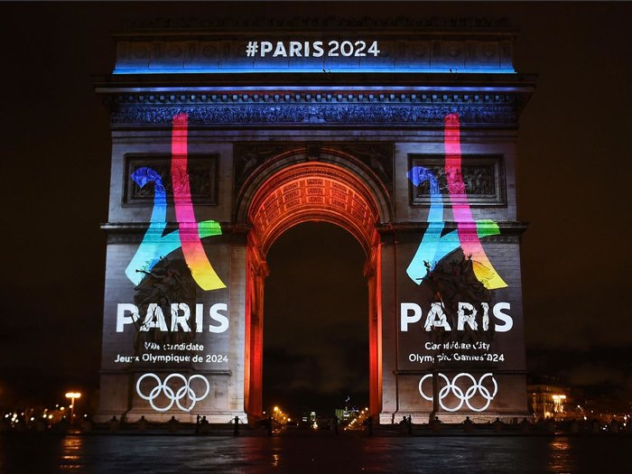
The Paris 2024 logo colourfully amalgamates the numbers two and four into the shape of the Eiffel Tower.
The 4 Global logo looks similar but is less brightly coloured, rotated clockwise slightly and has less curved lines.
The Paris 2024 logo was designed by French design consultancy Dragon Rouge.
An article in the the French edition of GQ magazine raised the similarities between the two designs.
The company has said that there was no "willingness to copy it" and that there has been a "legal check," according to a translation by The Local of comments made to GQ.
Designer Kheireddine Sidhoum also said to GQ: "You`re freaking me out."
The logo was revealed to much fanfare on Tuesday, projected onto the Arc de Triumph.
“The new visual identity of the Paris 2024 campaign reflects the values and ambitions of our bid,” said Paris 2024 co-chairman Bernard Lapasset to Euronews.
“We believe this logo captures the essence of Paris as a forward-thinking, modern capital city that is also proud to celebrate its rich culture and heritage."
“As we progress in our campaign to host the Games in 2024, it is wonderful to be here in the heart of the city with thousands of Parisians and people from all over to world to see our bid logo displayed on an iconic global landmark.”
Paris is competing against Budapest, Hungary, Rome, Italy and Los Angeles, United States for the chance to host the Olympic Games in 2024.
Last year, the Tokyo 2020 committee was forced to scrap its logo after a Belgian designer took legal action, saying the logo closely resembled work he had done for a theatre.


