


Pink is a double-edged sword. While red is raucous and racy, and white is prim and pure, pink cuts both ways. Long before the word “pink” attached itself to the pretty pastel shade of delicate carnations, as we define the term today, the London underworld enlisted it for something rather less frilly or fragrant – to denote the act of stabbing someone with a sharp blade. “He pink’d his Dubblet”, so reads an entry for the word in a 17th-Century dictionary of street slang used by “Beggars, Shoplifters, Highwaymen, Foot-Pads and all other Clans of Cheats and Villains”, describing a lethal lunge through a man’s padded jacket, “He run him through”.
At what point the unlikely linguistic slide was made from mortal piercing to mellow pigment, no one can say for sure. But the enticing hue itself, by whatever name it was known before the assignment of “pink” to the colour chart in the 18th Century, has kept culture blushing since antiquity. Now seductive, now innocent, pink is coquettish and coy, sultry and sly.
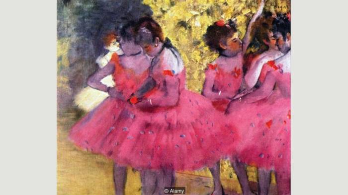
Dancers in Pink (1880-1885) by Edgar Degas is lifted by its striking hue and a style the artist called “premeditated instantaneousness” (Credit: Alamy)
Remove pink from the palette of art history and a teasing dimension to the story of image-making would be lost. Edgar Degas’s Pink Dancers would fall flat-footed and Pablo Picasso’s pivotal pink period wouldn’t rise to the occasion.
A flesh in the pan
A key moment in pink’s emergence as an essential element in the development of painting is the creation by the Early Renaissance Italian painter Fra Angelico in the middle of the 15th Century of his famous fresco in the Convent of San Marco in Florence, Italy, The Annunciation, which depicts the moment in the New Testament that the Virgin Mary is informed by the Archangel Gabriel that she will become the mother of Christ. Situated at the top of a staircase solemnly ascended daily by pious monks, Fra Angelico’s ground-breaking painting is one into which an observer’s spirit is summoned to levitate.

Fra Angelico’s fresco in Florence (1439-1444) depicts the archangel Gabriel in pink (Credit: Alamy)
Crucial to sparking that mystical lift-off in the fresco is the portrayal of the ethereal Archangel – who has himself mystically crossed planes of being to swoop into Mary’s material sphere. Never mind the polychromatic wings, what’s most surprising about Gabriel’s depiction is Fra Angelico’s decision to clad him in plush pleats of sumptuous pink.
We know from a contemporary artist’s handbook on how to concoct pigments (Cennino Ceninni’s Il libro dell'arte, published a few decades before Fra Angelico painted his fresco) that pink had been traditionally reserved primarily for the rendering of flesh. “Made from the loveliest and lightest sinopia that is found and is mixed and mulled with St. John’s white”, Cennini explains, “this pigment does you great credit if you use it for painting faces, hands and nudes on walls”.
By draping Gabriel in the lushest of pinks, Fra Angelico fleshes the Archangel out as a being of body and blood, breaking down the distinction between holy spirit and ephemeral flesh. Pink is the pivot that humanises heaven. No one would ever see the colour the same way again. In the ensuing centuries, artists would invoke pink as shorthand for the blurring of boundaries.
Bloom of Christ
As the focus of Renaissance master Raphael’s Madonna of the Pinks, a sprig of blushing carnations handed to the Virgin Mary by the infant Christ, may seem unremarkable enough at first glance. In fact it amounts to a kind of miraculous wrinkle in the fabric of time. According to religious tradition, dianthus (the Greek name for the plant, meaning “flower of God”), did not appear in the world until Mary wept at her son’s crucifixion.
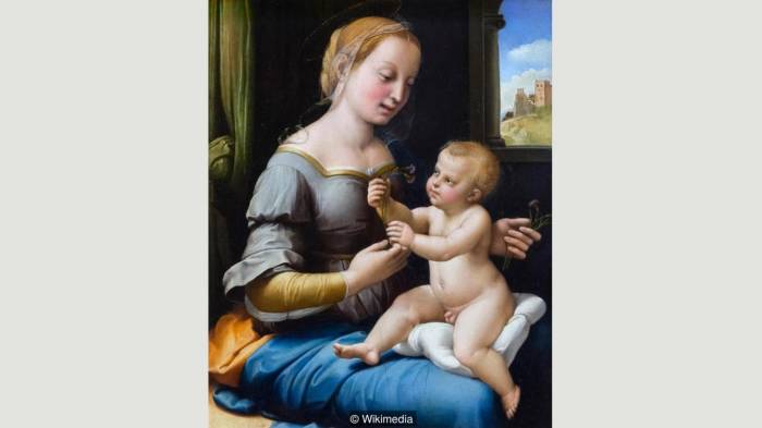
Painted around 1506, Raphael’s Madonna of the Pinks introduces carnations – believed to have first appeared at Christ’s crufixion – to the infant Jesus (Credit: Wikimedia)
The flower’s anachronistic appearance in Raphael’s scene, therefore, tinged with the future blood of the baby who holds it, mysteriously establishes a pink kink in the linear unfolding of the universe.
Over time, pink would eventually blossom beyond the petals of its complex theologies to inflect a wider array of secular personality, all the while retaining its elusive allure and capacity to tease. By the 18th Century, pink was offering itself as the colour of choice for portraying high-profile mistresses, daring observers to deny its very legitimacy as a respectable hue.
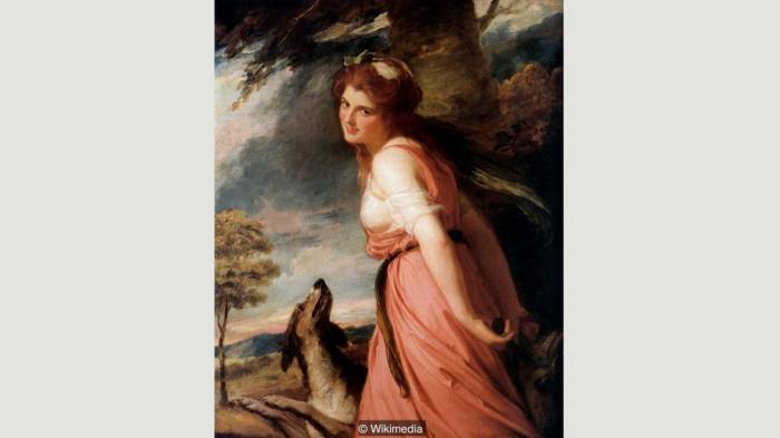
George Romney made many paintings of his muse, Lady Hamilton: in this (1785), she is shown as a follower of Bacchus, the god of wine and intoxication (Credit: Wikimedia)
Famous portraits by the French Rococo portraitist Maurice Quentin de la Tour of Madame de Pompadour and by the English artist George Romney of his muse Emma, Lady Hamilton (later mistress of Lord Nelson), posing as a mythological maenad, reveal how decidedly deconsecrated the colour had become.

Maurice Quentin de la Tour’s Portrait of the Marquise de Pompadour shows the mistress of King Louis XV in pastels (Credit: Wikimedia)
La Tour’s full-length pastel-pencil portrait of the official chief mistress to Louis XV of France, begun around 1748, is a rumbunctious jungle gym of superfluous pinks that spider across every inch and threaten to suffocate its subject. Here, pink is an energy that vibrates from the sitter to the secular subjects with which Pompadour has surrounded herself – music, astronomy, and literature.
Porcelain pink
A patron of the porcelain trade, Pompadour had famously inspired the minting by the Sevres porcelain factory of a new hue of pink, delicately bruised by dabs of blue and black. To Pompadour, pink was no longer a mere accessory but a partner in crime – an aspirational second skin into which she grew intellectually and emotionally. She became her colour.
No painting embodies pink’s gradual pendulum movement from the spiritual to the secular more vividly than the French artist Jean-Honoré Fragonard’s exuberant The Swing, painted around 1767, between La Tour’s and Romney’s works. Here, a fabulous flounce of flowing rose is frozen in mid swivel as the swinging girl, pillowed in pinkness, flicks loose a silk shoe, attracting the titillated attention of any number of camouflaged male gazes hiding in the bushes around her. We’re a long way from the pink whisper of angels now.
In more recent times, pink continues to be seized upon by artists keen to confound our expectations of what notes or message the floral pigment can confidently carry. Having established a formidable reputation in the middle of the 20th Century as a first-generation Abstract Expressionist, eschewing figurative subjects entirely in the 1950s, Canadian-born American artist Philip Guston reached for pink in a dramatic turn back to representational art in the late 1960s.
By then, the colour itself had undergone something of a commercial transformation in American retail culture, having begun the century as a shade more often associated with boys and masculinity than fairy princesses and little girls’ dolls. But by the time Guston began introducing a menacing cast of Ku Klux Klan-inspired cartoon goons, whose implausibly pale pink stubby hoods continue to menace popular imagination to this day, the colour had been re-commodified as delicate and feminine. Grabbing pink by the scruff for his unsettling scenes of a seedy Americana, Guston slaps Barbie across the chops.
At the same moment that Guston’s provocative pink was poking the art world in the eye, scientific studies were underway by Alexander Schauss, Director of the American Institute for Biosocial Research, to determine whether manipulations of the colour could help control the behaviour of subjects surrounded by it. The result of Schauss’s investigation was the concoction of the psychologically subtle shade now known as “Baker-Miller Pink”, after the Naval correctional institute in Seattle, Washington where the pigment was successfully tested on the walls of inmates’ cells and credited with a significant calming of aggressive urges.
Yet despite its ability to inspire docility, pink is still picking fights, challenging our perceptions to an aesthetic duel. Upon learning that the British artist Anish Kapoor had signed a contract giving him exclusive rights to a recently engineered colour known as Vantablack (the darkest shade ever devised), and the legal right to prohibit other artists from doing so, Kapoor’s younger contemporary Stuart Semple saw red.
Emboldened by Kapoor’s black embargo, Semple began concocting a supremely-fluorescent pink paint he contends is the “pinkest pink” ever contemplated (“no one has ever seen a pinker pink”, he insists). As a poke in the eye of Kapoor, Semple has made his colour available at a small price to anyone in the world so long as they confirm that they are not Anish Kapoor nor friendly enough with Kapoor to share it with him. En garde, Kapoor. You’ve been pink’d.
Read the original article on BBC.
More about: arts


-1780923278.jpg&h=190&w=280&zc=1&q=100)