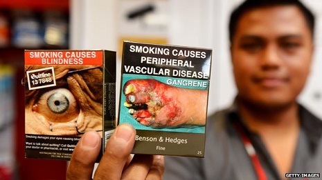
WARNING: some readers may find the images below disturbing
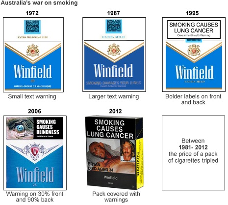
On Saturday 1 December 2012, Australia introduced the world`s toughest restrictions on cigarette packets. On that day, they became drab brown containers, without distinguishing features other than the brand and product name. This was written in a prescribed colour - Pantone Cool Gray - and font - 2C Lucinda Sans regular, size 14 and 10.
Graphic health warnings depicting the consequences of smoking covered 75% of the front of the packs and 90% of the reverse.
But before the month was out, smokers began noticing a small change to some of their cigarettes. Under the new rules, these were meant to be unbranded, but a mysterious three-letter call sign had begun to appear near the filter. For Benson and Hedges, it was LDN. For Holliday, it was ESC. Winfield bore the legend AUS, while Pall Mall got NYC.
"It`s the cigarette companies trying to push the boundaries," said Health Minister Tanya Plibersek. The owner of the brands, British American Tobacco Australia, was not fined, but was told to remove the mysterious insignia forthwith.
The episode shows how desperate the tobacco companies are to give their cigarettes a distinctive character - something, however small, that consumers can respond to - and how determined the Australian government is to stop them.
Australia is still dealing with the fallout from the plain packaging law. The companies said it violated their intellectual property rights, sued, and lost. But Philip Morris is still seeking to overturn the law on the grounds that it breaches a bilateral investment agreement with Hong Kong (the company moved part of its business there from Australia soon after plans to introduce the law were announced). Separately five countries - most of which either grow tobacco or manufacture cigarettes - have taken a case to the World Trade Organization, arguing that the law distorts the market.
While the litigation is deterring some countries, such as New Zealand, from following Australia`s example, others are giving plain packaging active consideration.
The UK may introduce legislation next year - and if the Westminster parliament decides against it, Scotland has signalled it may press ahead independently. France and Ireland have also expressed a determination to adopt plain packets. Dr Crawford Moodie of the University of Stirling foresees a possible domino effect in Europe, once the first country makes its move.
"It will be interesting to see if the uptake of plain packaging follows a similar pattern to pictorial health warnings," he says. "They were first introduced on packs in Canada in 2000 and five years later were only required in five countries, but by 2016, that will be at least 95 countries."

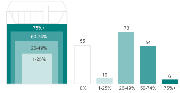
The size of the images varies, and so do the images themselves. The EU has a library of 42 pictures, which all focus on health risks, but other countries sometimes warn smokers about the impact of the habit on their wallets, or use so-called "gain" messages - positive encouragement to smokers explaining that they can rid themselves of addiction.
A new set of photos, developed for African countries, includes humorous images relating to impotence but there are also graphic pictures, such as a man with a vast tumour swelling from his mouth, and a miscarried baby lying on a towel.

Images intended for health warnings in Africa, showing (clockwise from top left) birth defects, rotting teeth, gangrene, impotence, throat cancer and blindness
"You`re trying to scare smokers, and get them to rethink their addiction," says Rebecca Perl, from the World Lung Foundation, which was commissioned by the World Health Organization to create the image library.
David Hammond of the University of Waterloo in Canada argues that some of the most powerful warnings are not only scary, but also tell a story about real people.
"It`s a very effective way of changing the discussion around these topics from `The government`s attacking me, the government`s preaching to me`, to `There`s a real person and here`s what happened to them,`" he says.

Health Canada`s warning featuring Barb Tarbox
A particularly famous face in Canada is Barb Tarbox, a former model who died at the age of 42. In the months leading up to her death from lung and brain cancer in 2003 she gave anti-smoking talks to schoolchildren, and allowed distressing images of herself, taken in hospital, to appear in campaigns. Her image is still used on cigarette packets today.
Among developed countries, the US is an outlier. Despite being the first country to introduce a health warning on cigarette packets back in 1965, it now belongs to a tiny group of countries that have not ratified the WHO`s Framework Convention on Tobacco Control, and do not force manufacturers to put prominent warnings on the front or reverse of packets. South Sudan, Haiti and Malawi are in the same position.
A federal act requiring picture warnings became law in 2009, but tobacco companies sued, and a judge threw out the nine images that had been chosen for the packets, ruling that they violated the manufacturers` constitutional right to free speech. For now the US health warning merely consists of text on the side of the packet - the same text that has been there since 1984.

Two of the American warning images ruled to have violated the right of free speech

The four text warnings that have been present on US packets of cigarettes since 1984
The gruesome images adorning cigarette packets in an ever-growing number of other countries reflect two important realisations - cigarettes kill roughly half of the people who use them regularly, and the packets play a different role from most other packaging.
Most packaging is discarded before the product is used for the first time. But smokers - like gum-chewers and mint-suckers - continue to use their packets until they`ve stubbed out their last butt.
This isn`t just about convenience. In the 1970s researchers found that an individual`s experience of smoking can be shaped by the name of the cigarette or the colour of the packet. A 1978 experiment further found that when male and female smokers were given identical cigarettes, with half the packs branded Frontiersman and the other half April, men preferred the taste of the former and women the latter.
As former cigarette packet designer John Digianni once put it, a cigarette packet is "part of a smoker`s clothing". When the smoker "saunters into a bar and plunks it down", he said, "he makes a statement about himself".
This was in 1980, decades before public smoking bans made the plunking down of cigarette packets on bar tables a rare sight in many countries. But daily smokers still retrieve their packets from their pockets and handbags some 7,000 times a year - and in countries where bans have been accompanied by the removal of advertising from TV and billboards the packet is often the last remaining vehicle for the brand.
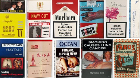
Top L-R: Taiwan, India, Belgium, Thailand, Ireland, USA. Bottom: UK, China, Uruguay, Australia, Mexico
And yet, as the health warnings grow, the cowboys and camels shrink... and could eventually disappear altogether.
"Smoking is dangerous and addictive," Philip Morris told the BBC in a statement. "We support clear and consistent health warnings on our packaging and recognize the important role they play in tobacco control policy. In fact, we are such strong supporters of health warnings that we place them on our products voluntarily in countries where they are not required. However, we oppose excessively large health warnings that infringe on our intellectual property rights and have been proven not to reduce smoking rates."
Do cigarette health warnings work?
It`s hard to draw a clear line of causation between health warnings and numbers smoking in a country, as they are usually introduced together with other measures such as tax increases and ad campaigns
Research from the University of Bristol using eye-tracking equipment shows that smokers avoid looking at health warnings
This doesn`t necessarily mean smokers aren`t reflecting on the messages - they may also avoid the images by foregoing a cigarette
Surveys of ex-smokers say health warnings were effective in getting them to quit
Research shows smokers are more likely to remember health messages when they are accompanied by images
Health warnings in the UK have been more effective at deterring new smokers than at getting existing smokers to quit, Moodie says.
The tobacco companies have responded to the spread of in-your-face health warnings with litigation and lobbying - Philip Morris spent 5.25 million euros (£4.2m) on lobbying the EU in 2013, more than any other company.
But also, as scope for branding by means of graphic design has diminished, they have focused more on the structure of the packet.
"In 2006, a pack was introduced which, rather than opening from the top - the traditional flip-top opening -opened from the side," says Crawford Moodie. "Now, you might not think that`s a big deal but that example of structural packaging innovation increased UK sales for that particular brand variant by £75m."
Side-opening packs also have an interesting side-effect - when the packs are open, the health warning occupies a smaller percentage area.
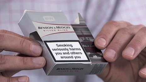
A side-opening pack of cigarettes
Another example of a structural change is the so-called "book pack" design, which opens in two along a spine. When a pack is left open on a table, no health warnings are visible and the inside of the pack can be branded just like the outsides used to be. "It extends the communication space for tobacco companies, but of course in many respects undermines the on-pack warnings," says Moodie.

A "book pack" without warnings on the inside
A variant of the book pack design was released in Australia before the country introduced plain packaging. It could be torn in two, allowing hard-up smokers to share a packet of cigarettes and split the cost. However, half the pack did not then bear the mandatory warning, so the design was banned. The country`s plain-packaging law now outlaws all packets except the standard flip-top design.
Elsewhere, the industry has often continued to target women with slimline packets that look like perfume boxes. These, as Crawford Moodie points out, sometimes make the health warning difficult to read.
Tobacco companies have also chosen colours carefully, for areas of the packet not covered by the health warning.
In more than 40 countries, cigarette companies are now prevented from using terms like "mild", "light" and "low-tar" since these perpetuate a common misunderstanding among smokers that such cigarettes are less harmful. But in most countries there is nothing to stop cigarette companies retaining the colour schemes associated with these cigarettes in the past, or introducing new ones.
"Tobacco companies have engineered packaging over decades so that we associate terms like `light` and `low tar` with packs that come in lighter colours, and many consumers mistakenly assume they are safer," says Moodie.
"Pack designers often say that colour is the single most important element of pack design."
Curtailing tobacco companies` freedom to use colours is one of the main reasons some governments are keen to follow the Australian plain packaging model. Studies have shown that plain packs also make health warnings more eye-catching to users, and the whole pack less glamorous and appealing.
Moodie is the last person to underestimate the tobacco companies. Their flair for innovation, and the sheer size of their budgets makes it "very hard for public health to compete," he says.
He adds: "While tobacco companies exploit the entire cigarette pack, including the cigarette, as a sophisticated communications tool, policy makers are less creative."
The same techniques the tobacco companies use to attract consumers should be used by governments to dissuade them from smoking, he argues. Since the companies stamp their brand name on each cigarette, he asks, why not put a health warning there too?
He has even mocked up an example of a cigarette carrying the words "Smoking kills"


